UP until eight years ago having a Marc Berthier creation generally meant living or working in one, or sitting or dining on one (if not yelling at one). Strapping a Berthier-penned timepiece on the wrist was, prior to 2010, an unheard-of proposition. But when Hermes artistic director Pierre-Alexis Dumas and Berthier, upon the prompting of then Hermes chairman Jean-Louis Dumas (Pierre-Alexis’s late father), imagined and eventually produced the first Hermes Carre H, the result was a watch seemingly designed by someone who has been designing watches all his life. The product was an object neither sparse nor overwrought, neither faddish nor stuffy. The piece was sartorial without it being too self-conscious about being so.
This, though, does not mean the original Carre H can do without any update — it has been eight years since it was first put to market. So earlier this year Hermes and Berthier brought out their latest take on the Carre H. And the current watch is not merely an update to what seemingly appeared as an “un-update-able” design, it actually takes a step further toward setting the very template for carre-shaped (carre is French for square) watches.
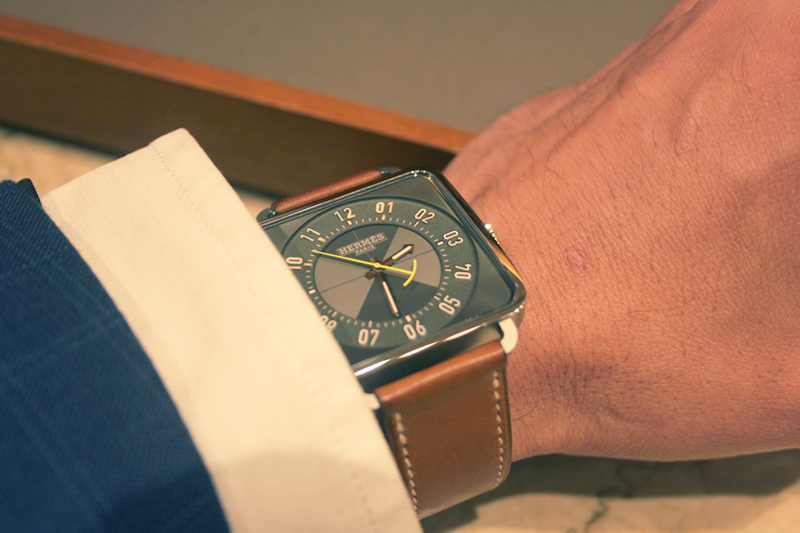
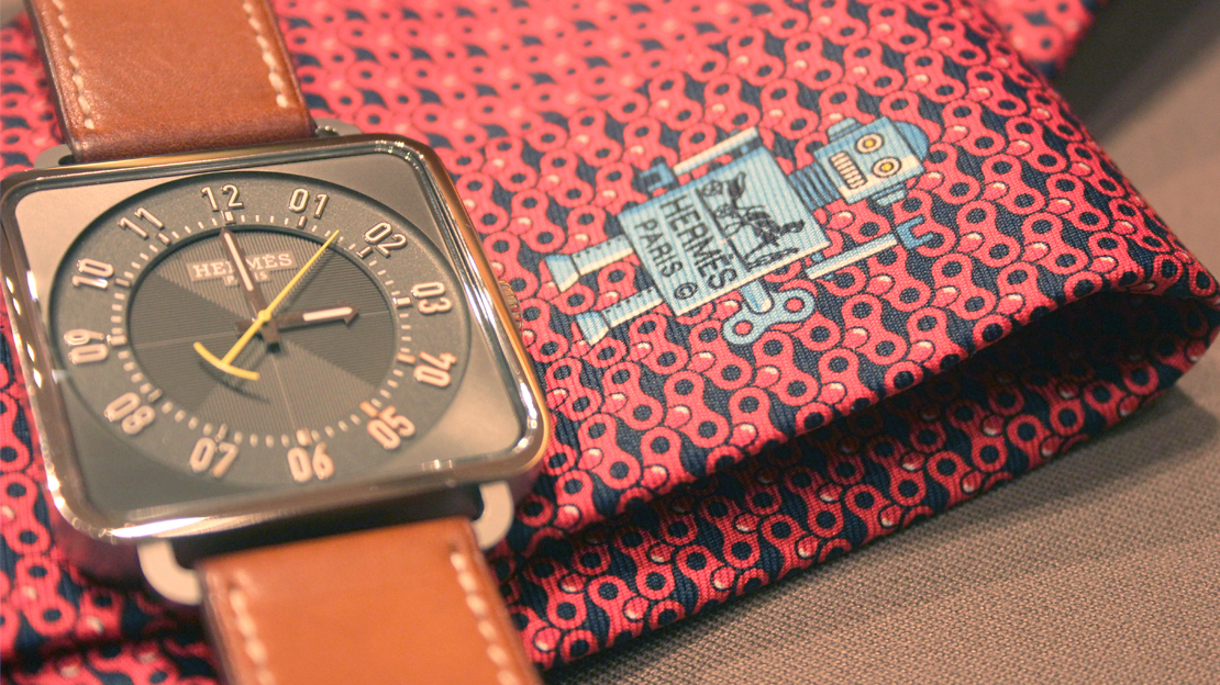
The new Carre H retains the basic silhouette of the original, meaning what would have been a merely blocky case — as square watches are wont to have — is softened by rounded edges and a thin bevel that gracefully droops outward. Even the “towel rack” lugs, as Hermes calls them, are unchanged in shape. Such faithfulness to these touches have allowed the watch to grow in scale — from the original’s 36.5-millimeter square to the new piece’s 38 millimeters — without it turning into a visual and literal cumbersome lump of metal on the wrist. Not bad, considering the new watch has discarded the titanium wardrobe of the original in favor of steel.
And where the dial furniture of the previous Carre H was angular and hinted of 1970s architectural details, if not period jewelry, the latest piece has opted for a concentric arrangement of its hour markers and minute track. Set within a clearly delineated circular recess (whose perimeter touches the edges of the bezel), the resulting look is that of a dial within a dial. Or a fusion of order and boundless space, as geometric principles will try to number-crunch.
It may sound silly, but think about it: It’s the Apple Watch’s rectangular shape that disallows it an elegant way in which to display a round-watch graphics — simply, there’s just too much negative space left on the rectangle surrounding the circle when its readout goes circular. A circle wrapped within a square is most space-efficient. The “rules” of proportion are innate.
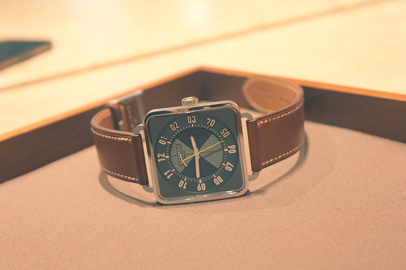
Berthier obviously obsessed about creating this balance — it was already apparent in the first Carre H version. Opting to use numerals instead of linear indices in the current watch challenged this balance (the indices in the original Carre H were arranged perfectly symmetrical, and while this was tidy, some were literally off the mark). Numerals come in single and double digits, after all. The solution, then, was to opt for double digits all throughout, so a zero preceded digits 1-9 in the present watch.
The fuss did not end there, typography was also a concern. A new san serif font whose sharp edges were tempered by oval zeroes and a few rounded portions, as well as by its relative narrowness, was actually developed for the current Carre H. Despite it being a fresh design element, somehow the font manages to instantly evoke Hermes.
Adding another layer of balance and detail is a circular recess whose perimeter form the base of the simple minute track (every five minutes in it is blockier). This recess is equally divided in quarters diagonally, with two of them adorned with a subtle, linear guilloche pattern. The design element is very visible in photos, but on the wrist it’s more nuanced, catching light in a way that allows the dial an illusion of movement. A soft sunray brushing on the portions surrounding the round dial results in another surface dimension, too. This touch is more apparent in the Carre H’s gray-dial version.
Speaking of which, the present Carre H has two versions. One has a black dial with the piece’s distinctive second hand in red, the other a gray dial with a yellow second hand. The latter is subtler, more playful. Like an Hermes “robot” necktie.
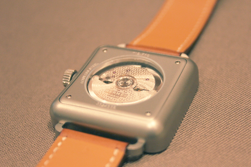
The Carre H’s caseback is restrained. Curiously, the case’s corners here are rounder, with more pronounced radii. Most likely this isn’t an aesthetic concern but more functional; it lets the watch drape over the wrist. A small sapphire crystal window (round, of course) allows a glimpse of the self-winding in-house cal. H1912, brought out by Hermes in 2012, and developed with Vaucher Manufacture, which Hermes partly owns. In the Carre H, the cal. H1912 (28 jewels, 28,800vph) has its rotor and bridges decorated with Hermes’s H tapisserie.
Well, the current Carre H itself is a tapisserie of details. That it remains subdued despite this (not to mention getting scaled up) elevates it from the mundane. So square pegs in round holes, square watches should no longer be from this point on. Obviously, this is all because of the Carre H.